David Morris.
I studied at Leeds College of Art and taught in Hull before moving to Lincolnshire. I was Lecturer in Ceramics at Grimsby School of Art, a Full Member of the Craftsman Potters Association and ran a pottery studio until I retired from teaching.
Since then I have concentrated on painting – mostly in watercolour.
My paintings have been exhibited at the Catto Gallery in London, with the R.I. at the Mall Galleries and with the R.W.S. at Bankside, as well as in many provincial galleries and exhibitions. I have shown in the Laing Art Competition and in the Singer and Friedlander/Sunday Times Watercolour Competition.
I have been awarded prizes from the Royal Watercolour Society, the Holmfirth Art Exhibition and the Patchings Exhibition (The Great Art Award 2006 and 2007 and the Winsor and Newton Award 2008).
I was a co-founder of the Louth Art Exhibition and I am a Member of the Lincolnshire Artists’ Society.
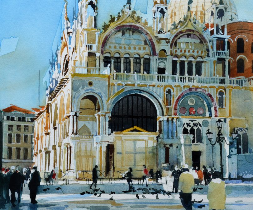
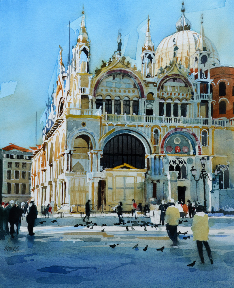
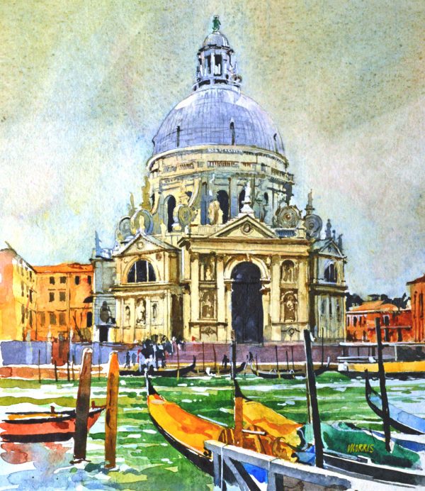
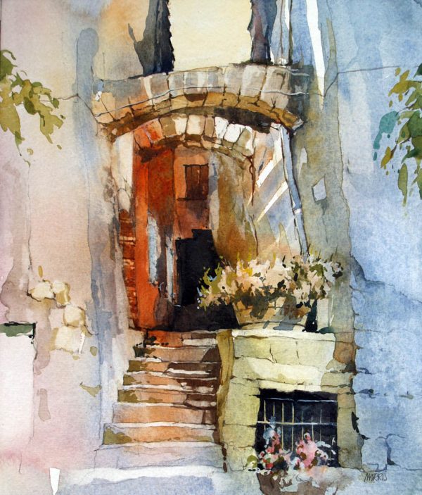
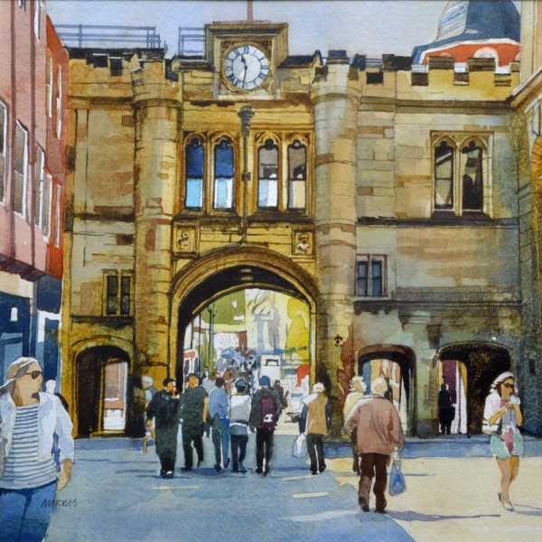
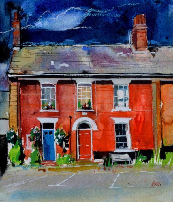
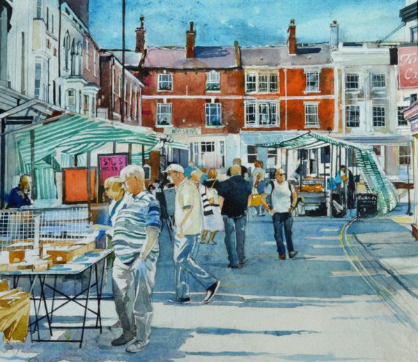
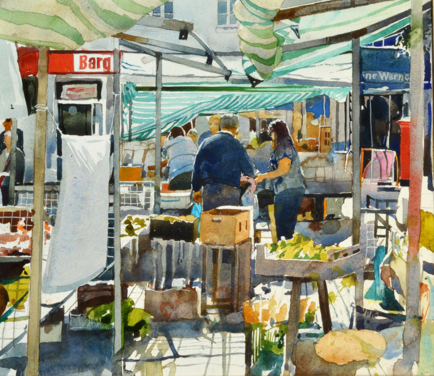
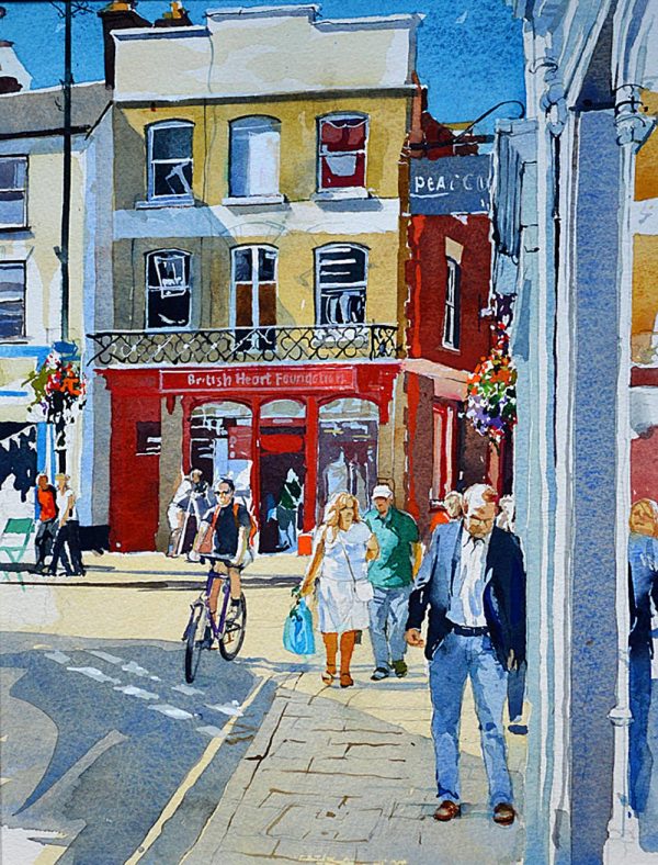
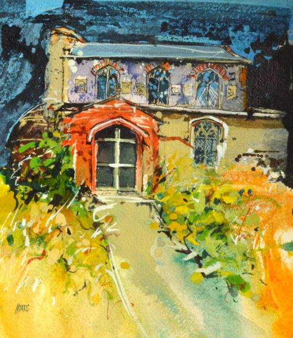
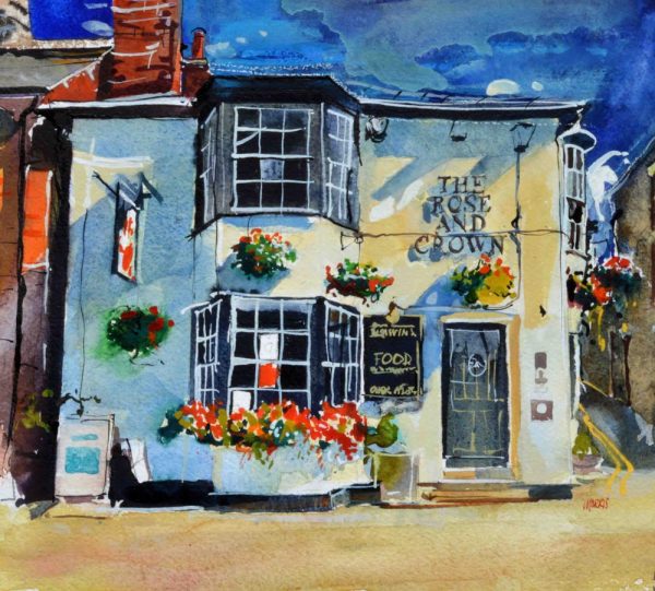
I enjoy painting convincing images of places that appeal to me in the hope that they might be appreciated by others. My subject matter includes architecture, boats, the coastlines of Norfolk and Yorkshire, New York, France and above all – Venice. Like countless other painters, I am enchanted by the crumbling facades of the buildings of that uniquely beautiful city. Visits to Europe and the USA have been rich sources of inspiration, but such visits are, of necessity, rather short and a camera has proved to be invaluable in providing a wealth of images for future work. For a particular painting of a complex subject I might work from ten or more photographs, each providing part of the necessary information.
Unfortunately, the camera does not see anything like as much as the human eye particularly in shadow, and there can be a great deal of distortion in both telephoto and wide –angle lenses. I find that, if the zoom is set so that the object in the viewfinder or on the screen appears to be the same size as to the naked eye, this produces the most satisfactory photographs for general purposes Close-ups and ‘shadow shots’ are useful for additional data. For example, on a bright day with plenty of sunshine and deep dark shadows, I take additional photographs just of the shadows because, otherwise, those parts of the picture can be too dark to provide any useful information.
Painters are often coy about the assistance provided by the camera, but it is the translation of the flat image and the communication with the viewer that are the test in any representational painting. I have no theoretical or philosophical objections to working from photographs since they are by far the most convenient method for collecting and storing information. It is important, however, that they are used as support and reference and not as something to be reproduced. Photographs are a storehouse of available detail from which to make selections rather than a source from which to copy.
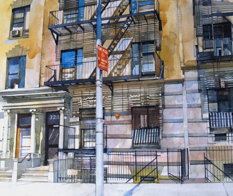
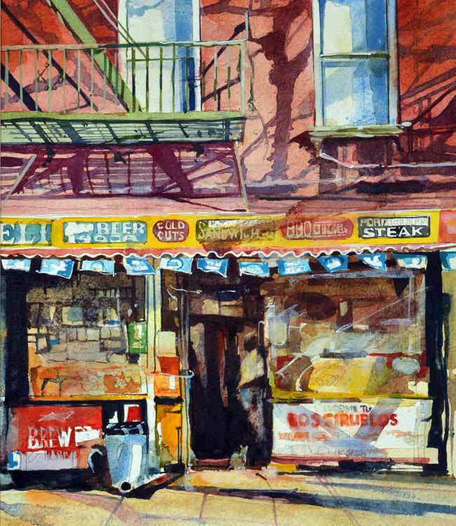
Sometimes, the taking of a photograph is the only method that is possible for catching an image. For example, the paintings of New York “M&I Deli- Harlem” and “Hanging out in Harlem” were done from photographs taken from a vehicle. It might have been an interesting experience to attempt to work from life in that district of New York City!
I always take my own photographs, sometimes waiting for the right light or searching for a particular image which, when caught by the camera in a split second with their brief and unique qualities of visual magic, are difficult to capture by drawing alone. A photograph of such moments makes the information invaluable.
A loose approach in watercolour….
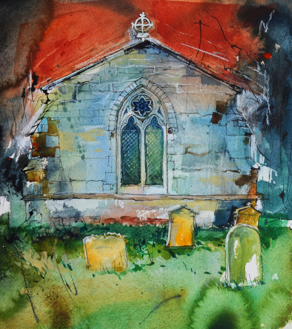
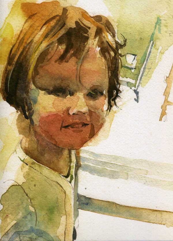
My paintings often depend on preliminary drawing but I try to use colour freely and loosely straight away. The paint has now become a part of the conception of the painting, often setting the mood to it. I do try to remove the feeling that the work starts with drawing and ends with paint as added decoration. There are occasions when I start a painting directly with a wet-in-wet approach, using more drawing and definition as the work progresses. At other times, I draw the subject in pencil quite thoroughly before using paint. With this latter method it is sometimes difficult to maintain a loose approach.
I feel that the freshness of the paint and its luminosity are vital and, although I use robust paper, I try to avoid corrections to the drawing using an eraser. This can damage the paper surface and cause problems later.
I want the paint to have the translucent qualities associated with traditional watercolour, but, rather than leave the white paper for highlights, I use Designer’s Gouache permanent white sometimes making it even ‘whiter’ with titanium pigment and Gum Arabic. In areas where pure white is not needed I prefer to use thin, transparent glazes of colour over the white rather than mixing the colour with it.
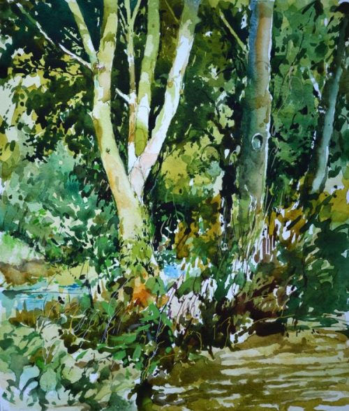
Like other painters, I often use multiple layers of glazing, Very thin alternate washes of quinacridone red, raw sienna and phthalo blue can make the most beautiful skies, and the same technique of overlaying washes can soften and unify work which might otherwise be too harsh.
Combinations of quinacridone red, viridian and pthalo blue are also extremely useful for dark passages, as these three colours seem to be particularly powerful especially with the addition of Gum Arabic.
Materials
My papers of choice (UK) is Two Rivers (Not) in 200lb (420gsm), Hahnemuhle, Sennelier and Bockingford 250lb weight for works up to 15” x 22” and 300lb (630gsm) for larger paintings. I find it an excellent surface and the sizing suits my way of working. It accepts watercolour readily but absorbs little of it so that the colour is bright and glowing. At the same time it is a robust paper, which allows for a considerable amount of scrubbing and sponging without the surface becoming damaged. Both these weights permit wet working without problems but, nevertheless, I prefer to stretch it onto boards using both 2” gummed tape and a staple gun for security. The paper is strong enough to pull away if gummed tape alone is used.
My paintbox
I purchase my paints in tubes and dispense it into the wells of ice-cube trays. There is a larger quantity of paint available then and it tends to harden a little. My mixing palette is a baking tray (which I hardly ever clean!)
I use tube paints by Daler-Rowney, Winsor and Newton and Schminke. My basic range includes raw sienna, burnt sienna, raw umber, burnt umber, cobalt, ultramarine, phthalo blue, permanent yellow, quinacridone gold, viridian, permanent red, light red, quinacridone red, Chinese white and Designer’s Gouache permanent white
This choice of colours has evolved gradually to meet the need for strong transparent pigments which can be applied easily and yet can be removed without problems by sponging or by using water and tissue.
The sizes of the paintings vary between 9” x 9” to 18” x 22” with the majority about 15” x 13” mostly portrait alignment. The paintings themselves are almost always figurative and it is a constant struggle to keep the application of the paint loose and expressive and to “do less”. Knowing when to stop and leave well alone acknowledging that optimum moment of communication with the viewer is a painter’s nightmare. It is usually obvious when one has gone too far!
My brushes are Winsor and Newton “Sceptre Gold” in sizes 4 8 and 10, “Petit Gris” by Isabey in sizes 0,1, and 2 and Hakes 1.5” and 2” wide.
For more broad and loose paintings I use raw pigments with Gum Arabic as a binder. The proportion of gum determines the ability to manipulate the paint but, of course, if there is insufficient binder, the paint can be too fragile. Conversely, if there is too much gum the paint can shine and be somewhat glossy and brittle. However, there can sometimes be an advantage with this use of gum with conventional watercolours since it can reduce the tendency for dark colours to become dull. This dullness can also be caused by the use of a hair-dryer to speed up the drying. I prefer to hold the work upside down (but horizontally) in the rising air of a room heater.
Framing
When the work is to be shown in an exhibition it is necessary for the paintings to be framed. Trends and fashions in frame styles vary from time to time but I generally like to use plain wooden rims with softened corners about 1” square in section. For a painting 14” x 12” the glass size would be approximately 20” x 23” thus making the matt width very generous. I use conservation quality matts and acid free tape with a barrier card between the matt and the backing sheet in the frame. I have never had any problems with fading or with the edges of the matt going brown with age. The only problem is that, if the painting doesn’t sell, there is a possibility for the frame to be damaged hanging it, taking it down and transporting it. One of the hazards of being a watercolour painter I fear.
My studio has a large window facing east and, although I prefer to work in daylight there can be difficulties sometimes. Blinds can help but for those days in winter when there is just not enough light , I use angled lamps with daylight bulbs – particularly to illuminate my palette.
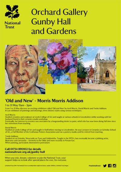
I shall be exhibiting my work in May 2019 in the Garden Gallery at Gunby Hall, Lincolnshire.
Also..I shall be exhibiting my work in June 2019 in the Riverhead Gallery at the Louth Riverhead Theatre.
David Morris, 40 Aswell Street, Louth, Lincolnshire LN11 9HP
Tel: 01507 606303
Click on David’s website link… www.davidmorris40.co.uk